

Desktop Social Media Design: A Practical Guide for Teams
Desktop social media design means building your posts, Stories, carousels and covers on a computer, where you have a large canvas, a real keyboard and easy access to your brand files. The best results come from a repeatable system: a small set of branded templates, the right canvas size for each platform, readable type and a quick review on a phone before you publish. This guide walks you through each piece.
TL;DR
- Start from editable templates, not blank canvases. They keep every post on brand and cut production time.
- Design at the native size of each platform, then check the result on a phone, because that is where most people will see it.
- Keep headlines short, text large and contrast high.
- Lock logos, colors and fonts for anyone who shares the work, and leave copy and photos open to edit.
- Batch a week of posts in one session, then schedule them together.
Table of Contents
- What does desktop social media design involve?
- Why design on a desktop?
- What should you look for in a desktop design tool?
- How do you design a social media post on a desktop?
- What image sizes should you design for?
- How big should text be in a social graphic?
- How do you keep every design on brand?
- Our perspective
- Which Photofy plan fits your design workflow?
- Which design mistakes should you avoid?
- FAQ
- Sources
What does desktop social media design involve?
Social media design is a specialized form of graphic design built for feeds. It covers ideation, planning and the look of your pages, and it takes platform requirements, engagement and shareability into account, as one agency guide describes it. In practice, that means producing a steady stream of visuals that look like they belong together.
The formats you will work with most often include:
- Feed post graphics, such as quote cards, product teasers and event announcements
- Story and Reel covers
- Carousels and data graphics
- Profile pictures, cover images and highlight covers
The same source lists post graphics, Story templates, cover and profile images, highlight covers and covers for formats like Reels among the main types. Formal training covers the same ground. A university course on graphic design for social, for example, teaches layout and grids, visual hierarchy, typography, color and contrast, carousels, templates and design systems, and brand kits.
One campaign rarely needs one image. A single campaign can require a dozen or more assets: square posts, landscape ads, vertical Stories, animated loops and size variants for each platform. That volume is the main reason a good desktop workflow matters.
Why design on a desktop?
A phone is great for quick edits and on-the-go posts. A desktop gives you more room for the work that benefits from precision:
- A larger canvas. You can see spacing, alignment and hierarchy at a glance.
- Easier file handling. Logos, product photos, PDFs and video clips are usually already on your computer.
- Faster batching. With a keyboard and mouse, duplicating a template and swapping the photo and headline takes seconds.
- Better collaboration. Reviewing and approving a week of posts is simpler on a full screen.
Most teams end up using both. You build and batch on the desktop, then check and tweak on mobile. Photofy is available on iOS, Android and desktop for exactly that reason, so the same templates follow you from one device to the next.
What should you look for in a desktop design tool?
The right tool depends on who is making the content and how many people share it. One buyer’s guide recommends evaluating brand controls, collaboration and comments, stock assets, export formats, integrations, role-based access, licensing and total cost at your actual seat count. Another set of selection criteria highlights ease of use, suitability for social media marketing, professional design assets and the ability to repurpose posts across formats.
Turn that into a short checklist:
| What you need | Why it matters |
|---|---|
| Pre-designed, editable templates | You start every post from a proven layout |
| Brand controls | Logos, colors and fonts stay consistent across people and channels |
| Stock asset library | You are never stuck without a usable photo or graphic |
| Video and overlays | Stitch clips and add text or graphics for Stories and Reels |
| Scheduling and analytics | You publish on time and see what works |
| Team and approval options | Local users create quickly while the brand stays protected |
For a broader look at the category, see our guide to the best social design apps for teams and creators.
How do you design a social media post on a desktop?
Here is a simple workflow that works for solo owners and busy teams alike.
- Pick the goal. Decide whether the post announces, educates, promotes or builds trust. One post, one message.
- Choose a template. Start from a layout that matches the message: quote, announcement, split screen, stats, event or carousel cover. One design blog suggests keeping five to seven core layout templates so you are not making new decisions for every post.
- Set the canvas size. Use the native size for the platform (see the next section).
- Swap in your photo or video. Use your own images where you can. Use the stock library to fill gaps.
- Write a short headline. Keep it to a handful of words and add a clear call to action.
- Apply brand elements. Add your logo, colors and fonts, or confirm the template already includes them.
- Check on a phone. Look at it at arm’s length, the way a follower will.
- Export or schedule. Save the correct file format or send it straight to your publishing queue.
Batch the week in one session
Batching saves the most time. One local-business workflow suggests planning three to five posts, gathering photos and details, duplicating templates and swapping in the content, then scheduling the week in a single 90-minute session. If you want a head start on topics, our free content calendars give you a planning frame, and our tips for creating quick images for social media show how to move faster without losing polish.
What image sizes should you design for?
Design at the native size from the start. Resizing a finished graphic often leaves awkward crops or empty edges.
| Placement | Size | Ratio | Notes |
|---|---|---|---|
| Facebook and Instagram feed | 1080 × 1080 px | 1:1 | The standard square format |
| Facebook and Instagram feed (portrait) | 1080 × 1350 px | 4:5 | Takes up more screen space and tends to outperform square in mobile feeds |
| Instagram Stories and Reels | 1080 × 1920 px | 9:16 | Keep key content inside the central safe zone |
For vertical formats, the same source advises keeping critical content within the central 1080×1420 safe zone, so buttons and captions from the app do not cover your text or logo. Platform specs change from time to time, so confirm the current numbers in each platform’s own help pages before you build a large template set.
How big should text be in a social graphic?
The most common desktop mistake is designing for the monitor instead of the phone. Review every asset on the device where it will be viewed, and set body text at a minimum of 30 to 40 pixels on the canvas.
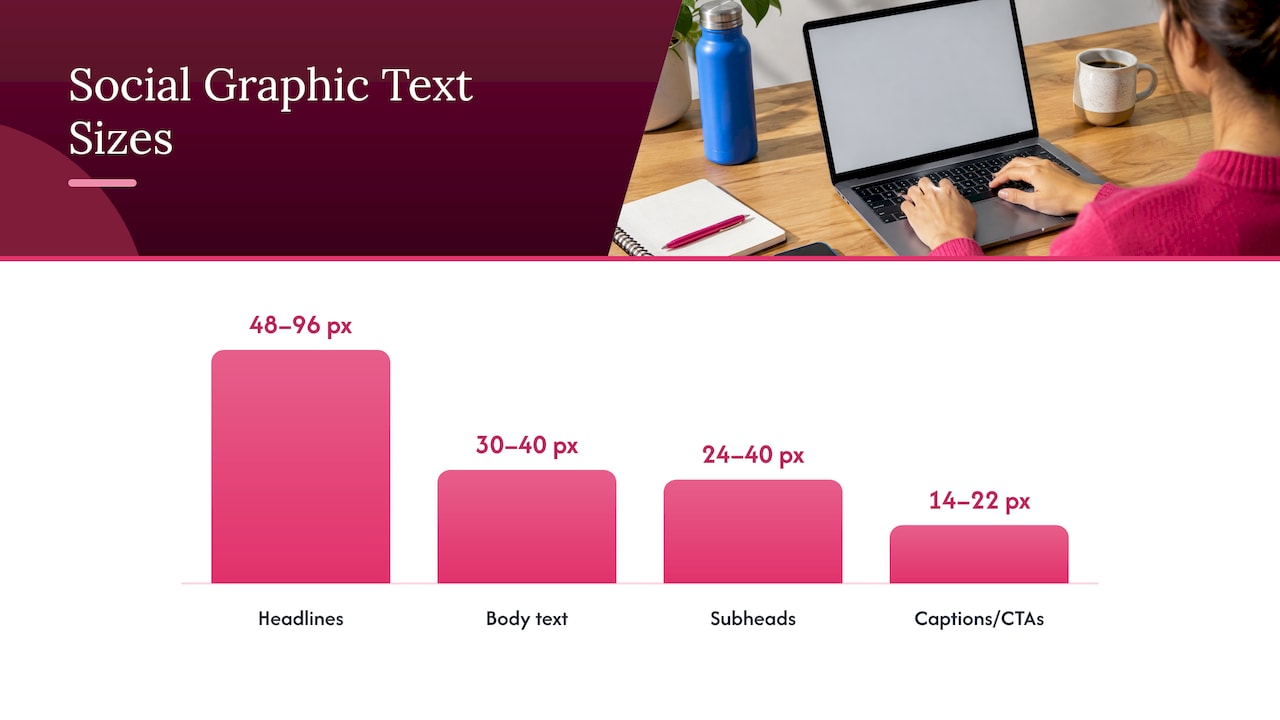
A useful starting point for a 1080 px canvas, based on one typography guide, is headlines at 48 to 96 px, subheads at 24 to 40 px and captions or calls to action at 14 to 22 px. The same guide recommends zooming out to about 33% to simulate how small the post looks in a feed, and avoiding thin font weights, hairline serifs and low-contrast text over photos.
A few habits make type easier to read:
- Keep headlines short. Eight words or fewer is a good limit.
- Put text on a solid or softly darkened area when it sits over a photo.
- Use one clear focal point per graphic.
- Leave breathing room around the edges.
The broader principle is that good social design organizes information so the most critical visual elements stand out and communicate a message. For more ideas on making content grab attention, these visual storytelling tips cover design principles for attention-grabbing posts.
How do you keep every design on brand?
Consistency comes from a defined visual system: palette, typography hierarchy, logo treatment, imagery direction and layout rules. Then you use editable templates instead of rebuilding each post. One template-library guide says templates should extend the brand identity system.
When several people create content, the same guide recommends that templates lock brand-critical elements such as logos, colors and fonts while leaving copy and imagery editable. That gives local users freedom to personalize while protecting the brand.
This is where team size changes the setup:
- Solo owners and freelancers need a handful of templates they can reuse every week. Our guide to photography templates and brand consistency shows the idea in action.
- Franchises and multi-location teams need shared templates that local owners can edit without leaving the brand guidelines.
- Direct selling companies need every rep to post compliant content that still feels personal. See how personal branding works for direct sales.
- Dealers and automotive teams often need photo, video and PDF assets in one place. Read how same-day publishing works for dealer templates.
- Agencies and enterprise teams may want a platform they can present under their own brand. Our guides cover white-label branding in more depth.
A tidy library helps all of these groups. Our asset library checklist explains how to name and organize files so people can find the right image fast.
Our perspective
Most teams do not struggle to find design ideas. They struggle to produce consistent, on-brand posts week after week, across several people and channels.
That is why we built Photofy around templates, a stock asset library and white-label content management in one place. Our platform is designed to give you branded content creation, team approvals, asset management and automated publishing together, so your local reps, franchisees or sales team can create quickly while your brand stays intact.
We believe the best desktop workflow is simple: start from a template, adjust the photo and message, check it on your phone and publish. When your templates carry the brand, everyone can move faster with confidence.
Jon
Which Photofy plan fits your design workflow?
Photofy brings templates, video stitching, graphic and text overlays, scheduling and analytics together on desktop and mobile. You can choose the level that matches how you work:
- Small Business: $10.99 per month or $99 per year. See the Small Business plan.
- Individual Plans: $11.95 per month, $29.97 per quarter or $99.95 per year. Compare the Individual Plans.
- Pro Teams: $13.00 per month per user.
- Enterprise Teams: $9.00 per month per user.
Franchise and enterprise solutions, including white-label options, are available through direct inquiry on our pricing page. There is also a free tier for personal use, which you can explore on our Personal Solutions page.
If you are ready to build your first branded post, start at Photofy and choose the plan that fits your team.
Which design mistakes should you avoid?
Beyond tiny text, a handful of problems show up again and again. Common mistakes include inconsistent brand application, text-heavy designs, ignoring platform aspect ratios and posting without a visual hierarchy. Here is how to avoid each:
- Inconsistent branding. Use templates with fixed logos, colors and fonts.
- Too much text. Move detail into the caption and keep the graphic to one message.
- Wrong aspect ratio. Build at the native size first, then adapt.
- No hierarchy. Decide what the eye should see first, second and third.
- Starting from scratch every time. Reuse layouts so you spend time on the message instead.
Series content also benefits from repeated visuals. Companies often connect several posts with consistent graphics, typefaces or illustrations, which builds anticipation and primes audiences for emotional connection. Our carousel post ideas use small three-part templates to do exactly that.
FAQ
What is the best size for a social media graphic?
For Facebook and Instagram feeds, 1080 × 1080 px is the standard square, and 1080 × 1350 px (4:5) uses more of the screen on mobile. For Stories and Reels, use 1080 × 1920 px. Check each platform’s help pages for current specs.
Can I design social media graphics on a desktop and edit them on my phone?
Yes. With Photofy available on iOS, Android and desktop, you can build a branded post on your computer and make quick changes on mobile. Always do a final review on a phone, since that is where most followers will see it.
How many templates do I need?
Most small teams do well with five to seven core layouts, such as quote, announcement, split screen, stats, event and carousel cover. Add more only when a campaign needs a new format.
How do I keep a team’s posts consistent?
Give everyone editable templates that already carry your logo, colors and fonts. Let people change the photo and copy, and keep brand elements fixed. For larger organizations, our brand consistency guide explains how tailored solutions help.
Can I schedule posts after designing them?
Photofy includes scheduling and analytics, so you can plan the week and review results. Our guide to choosing a scheduling tool lists what marketers should compare.
Sources
- Social Media Graphics: The Ultimate Guide
- CRE-230 Graphic Design for Social, HSM University
- How to Create Social Media Graphics & Ad Visuals
- How to Choose Graphic Design Software
- 5 best free design tools for social media graphics
- The Asset Factory: Building Efficient Systems for Social Media Graphics
- How to Create Social Media Graphics for Local Businesses
- 10 Social Media Design Mistakes Companies Make
- Typography for Social Media
- Create Social Media Graphics That Drive Engagement, Toptal
- Building a Social Media Graphics Template Library
- Visual storytelling tips: boost your brand’s impact