

Social Media Reporting for Marketers: Guide + Templates
Social media reporting is the practice of aggregating performance data across platforms, measuring KPIs against defined goals, and translating those numbers into analysis and recommendations that stakeholders can act on. A high-impact report does more than display metrics: it tells a story. The most effective format pairs a CMO-ready one-pager with a full deck of 8–12 slides covering period comparisons, top-performing content, audience insights, and clear next steps with owners and deadlines.
Key Takeaways
Effective social media reporting combines structured data collection, clear narrative, and specific recommendations with owners and deadlines — not just a summary of what the numbers say.
| Point | Details |
|---|---|
| Start with the CMO one-pager | Distill every month into 4 KPIs, one win, one risk, and one recommendation before building the full deck. |
| Keep the full deck to 8–12 slides | Executives grasp the story quickly; a report that can’t be understood in roughly 60 seconds needs restructuring. |
| Normalize before you benchmark | Use engagement rate per follower, not raw counts, when comparing your performance to competitors. |
| Automate exports before analysis | Set up scheduled data pulls and consistent campaign naming first; manual CSV stitching introduces errors at scale. |
| Photofy for brand-consistent templates | Photofy’s pre-designed templates and white-label capabilities help teams maintain visual consistency across every report and channel. |
Table of Contents
- What is social media reporting, and who reads it?
- Which metrics and KPIs should you include?
- How do you create a social media report in 6 steps?
- What should your report structure look like, slide by slide?
- Which tools and data sources should you use?
- How should you present findings to different stakeholders?
- How do you benchmark against competitors?
- What does research say about effective report length and structure?
- What the data tells you that most reports miss
- Photofy makes brand-consistent reporting easier at every scale
- Sources
What is social media reporting, and who reads it?
A social media report communicates performance, explains what drove results, and recommends actions tied to business goals. That last part is where most reports fall short. Raw numbers without context give stakeholders nothing to decide with. A well-built report connects the data to the question every executive is actually asking: “Are we getting a return on this, and what should we do differently?”
Different readers need different things from the same data.
| Stakeholder | What they want | Recommended format |
|---|---|---|
| CMO / VP Marketing | Business impact, trend direction, one clear recommendation | One-pager: 4 KPIs, one win, one risk, one action |
| Marketing manager | Channel performance, content insights, budget efficiency | 8–12 slide deck with channel breakdowns |
| Social media manager | Post-level data, engagement trends, content mix | Full appendix with raw tables and top-post screenshots |
| Sales / Operations | Lead volume, conversion rates, attribution | Filtered view: paid summary + conversion funnel only |
Report types vary by purpose. A monthly performance report covers cross-channel KPIs and content results for the prior month. A quarterly strategic report zooms out to trends, budget efficiency, and goal progress. A campaign-specific report isolates one initiative from launch to close. A platform-specific report goes deep on a single channel, such as Instagram analytics, when a team needs granular insight. A sentiment report tracks brand perception and community health over time.
Cadence guidance:
- Weekly: Active paid campaigns, crisis monitoring, or high-frequency content tests
- Monthly: Standard performance review for most marketing teams
- Quarterly: Strategic planning, budget reviews, and goal recalibration
- Campaign-based: Tied to a specific launch, event, or promotion with a defined start and end date
Which metrics and KPIs should you include?
Not every metric belongs in every report. The right KPIs depend on the objective. An awareness campaign calls for reach and impressions. A lead generation push demands CTR, link clicks, and conversions. Mixing all metrics into one undifferentiated table is one of the most common reporting mistakes.
The table below gives you the core cross-channel metrics, their definitions, and the formulas you need to calculate them consistently.
| Metric | Definition | Formula / Notes |
|---|---|---|
| Reach | Unique accounts that saw your content | Platform-reported; not additive across platforms |
| Impressions | Total times content was displayed | Can exceed reach (one user, multiple views) |
| Engagement rate | Interactions as a share of reach or followers | (Likes + Comments + Shares + Saves) ÷ Reach × 100 |
| Follower growth rate | Net new followers as a percentage of starting count | (New Followers ÷ Starting Followers) × 100 |
| CTR (Click-through rate) | Link clicks as a share of impressions | Clicks ÷ Impressions × 100 |
| Conversions | Goal completions attributed to social traffic | Tracked via UTM parameters + GA4 |
| CPM | Cost per thousand impressions (paid) | Spend ÷ Impressions × 1000 |
| CPC | Cost per click (paid) | Spend ÷ Clicks |
| ROAS | Revenue returned per dollar of ad spend | Revenue ÷ Ad Spend |
| Video completion rate | Share of viewers who watched to the end | Completions ÷ Total Views × 100 |
For content-level analysis, track post-level engagement rate, saves, shares, and watch time separately from channel-level aggregates. These post-level signals tell you which formats and topics resonate, which feeds directly into your content strategy recommendations.
When reporting paid and organic together, keep them visually separated. A stacked bar chart works well here: organic on one layer, paid on another, so the reader can see both the total and the contribution of each. Tying social metrics to the conversion funnel — impressions through engagement to link clicks to conversions — and showing attribution through UTM parameters and GA4 gives your report a direct line to revenue impact.
Pro Tip: Add a context column to every metric table: MoM change, a 3-month rolling average, and a benchmark. A number without comparison is just a number. A number that’s up 14% month-over-month against a benchmark of 8% is a finding.
How do you create a social media report in 6 steps?
A repeatable process saves hours each reporting cycle. Here is the workflow that produces consistent, stakeholder-ready reports.
Step 1: Define your purpose, audience, and timeframe
Before you pull a single number, decide who is reading this report and what decision it needs to support. SMART goals give you a practical framework for translating business objectives into measurable KPIs. “Increase brand awareness” is not a reporting target. “Grow Instagram reach by 20% month-over-month by the end of Q3” is.
Step 2: Choose KPIs that map to your objectives
Pick 4–6 primary KPIs per report. More than that and the story gets muddy. Secondary metrics can live in the appendix for anyone who wants to dig deeper.
Step 3: Gather your data
Pull from three source types:
- Native analytics: Instagram Insights, LinkedIn Analytics, Facebook Business Suite, TikTok Analytics, Pinterest Analytics
- GA4: Traffic from social, goal completions, assisted conversions, and UTM-tagged campaign performance
- Third-party connectors: Tools like Supermetrics extract data from multiple platforms into a single destination (Google Sheets, Looker Studio, or a BI tool), saving significant manual export time
Before you aggregate, run a quick data-cleaning check: confirm date ranges match across platforms, verify timezone settings are consistent, and check that campaign naming conventions are uniform. A single naming inconsistency (“Q3_Campaign” vs. “q3-campaign”) can break a join and produce misleading totals.
Step 4: Analyze trends and distill insights
Compare MoM and QoQ. Identify what moved and why. Did a spike in reach coincide with a specific post format? Did engagement drop when posting frequency increased? Context is what separates analysis from a data dump. As Shopify’s reporting guide puts it, a social media report must include analysis and recommendations, not only raw numbers.
Step 5: Write your summary and recommendations
Build the CMO one-pager first. If you can’t summarize the month in four KPIs, one win, one risk, and one recommendation, you don’t understand the data well enough yet. Every recommendation should follow this structure: action + quantity + timeframe + owner. For example: “Increase Reels posting to 4x per week through September, owned by [Social Manager Name], to recover the 12% reach decline seen in July.”
Step 6: Format and share
Choose the right format for the audience. A slide deck works for monthly reviews. A live dashboard suits teams that check performance weekly. A PDF export is right for executive distribution. Set a recurring calendar invite for report delivery so stakeholders know when to expect it, and version your files clearly (e.g., “SocialReport_July2026_v1”).
Pro Tip: Automate the low-value tasks first: scheduled exports, data pulls, and formatting. Save your time for the analysis layer, which no tool can do for you. Teams that try to automate nuanced interpretation before they’ve automated basic exports usually end up with neither working well.
What should your report structure look like, slide by slide?
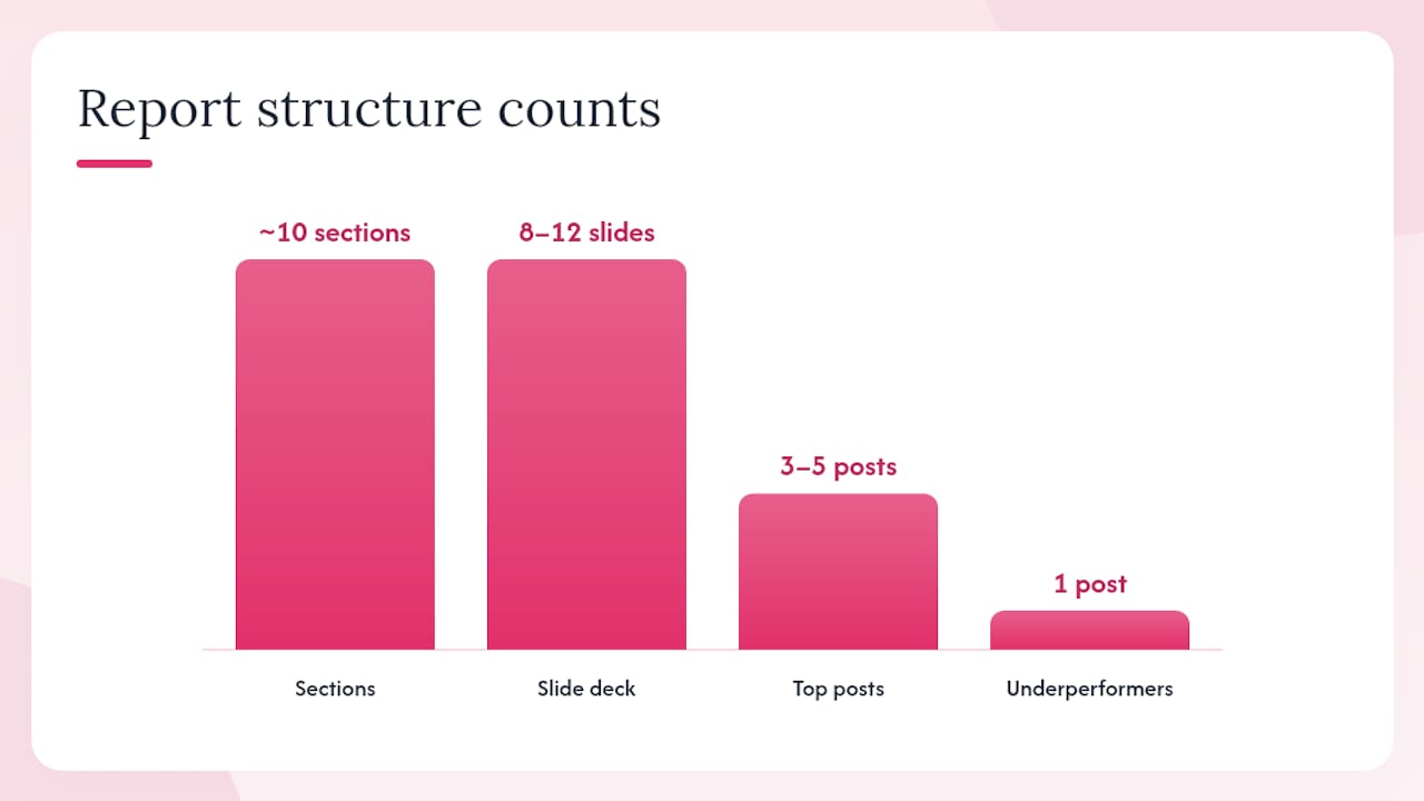
A practical monthly report uses roughly 10 sections and is designed to be completed in about 45–60 minutes when you’re working from a template. Here is the recommended slide-by-slide breakdown for an 8–12 slide deck.
- Slide 1 — CMO one-pager: Four headline KPIs (with MoM arrows), one top post thumbnail, one win, one risk, one recommendation with owner and deadline. This slide stands alone as a shareable executive summary.
- Slide 2 — KPI strip: A horizontal bar or scorecard row showing all primary KPIs vs. goal and vs. prior period. Color-coded green/yellow/red for quick scanning.
- Slide 3 — Channel overview: Side-by-side comparison of reach, engagement rate, and follower growth across all active platforms.
- Slide 4 — Top posts: Three to five best-performing posts with thumbnail, platform, format, reach, and engagement rate. Include one underperformer for contrast.
- Slide 5 — Content by pillar: How content breaks down by theme or campaign type, and which pillars drove the most engagement. A content calendar makes this analysis faster because your pillars are already tagged.
- Slide 6 — Audience insights: Demographics, top locations, active times, and any notable shifts from the prior period.
- Slide 7 — Paid social summary: Spend, CPM, CPC, CTR, and ROAS by campaign. Separate from organic to avoid inflating organic metrics.
- Slide 8 — Competitor signals: Two or three observations on competitor posting frequency, format mix, and engagement rate. Estimates only — see the benchmarking section below.
- Slide 9 — Recommendations: Three to five specific actions with owner, quantity, and deadline. Not “post more video.” Post: “Publish 3 Reels per week in August, owned by [Name], targeting a 15% lift in reach.”
- Slide 10 — Appendix: Raw data tables, platform-by-platform breakdowns, and any additional charts that support the narrative but would slow down the main deck.
For the CMO one-pager specifically, the goal is that a busy executive can grasp the month’s story in about 60 seconds. Research on executive report consumption confirms that key takeaways must land quickly or the report loses its impact. Keep the one-pager to a single page, use large typography for the headline numbers, and resist the urge to add explanatory text. If it needs a paragraph to explain, it belongs in the deck, not the one-pager.
Pro Tip: Use consistent screenshot sizing across all post thumbnails. Mismatched image sizes are the fastest way to make a polished report look rushed. Set a standard crop (e.g., 1:1 at 400px) and apply it to every post image before inserting.
Which tools and data sources should you use?
The right tool stack depends on your team’s size, budget, and how many platforms you’re managing. Here is how to think about each layer.
Native platform analytics are the right starting point for most teams. Instagram Insights, LinkedIn Analytics, Facebook Business Suite, TikTok Analytics, and Pinterest Analytics are free, accurate, and updated in near-real time. Their limitation is that they don’t talk to each other, so cross-channel comparison requires manual work.
GA4 and Looker Studio add the attribution layer. GA4 tracks what happens after someone clicks through from social — sessions, goal completions, and revenue. Looker Studio connects to GA4, Google Sheets, and third-party sources to build reusable, shareable dashboards that your team can schedule as PDF exports or share as live links.
Connector tools like Supermetrics sit between your platforms and your reporting destination. They pull data from Instagram, Facebook, LinkedIn, TikTok, and others into Google Sheets or Looker Studio automatically, on a schedule you set. This is the right move when you’re managing more than two or three platforms and spending more than two hours per report on data collection alone. For social media scheduling and content management, pairing a scheduling tool with your analytics stack keeps your workflow in sync.
Sprout Social and HubSpot both offer built-in reporting features worth knowing about. Sprout Social provides cross-channel social analytics with automated report generation. HubSpot’s marketing hub connects social performance to CRM data, which is useful when you need to tie social leads to pipeline. Neither replaces a custom reporting workflow for teams with specific stakeholder needs, but both reduce setup time for standard reports.
Automation priorities, in order:
- Scheduled data exports (set these up first)
- Dashboard auto-refresh (Looker Studio or your BI tool)
- Formatted report templates (build once, reuse every cycle)
- Alert thresholds (notify the team when a metric drops below a defined floor)
For teams considering when to move from manual spreadsheets to a centralized platform, the tipping point is usually when manual data stitching takes more than 20% of total reporting time. Consistent campaign naming conventions across every platform are non-negotiable before you make that move — broken naming breaks automated joins and produces misleading aggregations. See Sprout Social alternatives for a broader look at how agencies evaluate platform options at scale.
How should you present findings to different stakeholders?
The structure that works best for most reports follows a clear narrative sequence: executive summary first, then the performance evidence, then the analysis of why numbers moved, then the recommendation. This answer-first approach, recommended in best-practice analytics reporting, respects the reader’s time and makes the report scannable for executives who won’t read every slide.
Chart selection matters more than most teams realize. Use line charts for trends over time (follower growth, weekly reach). Use bar charts for comparisons across channels or content types. Use stacked bars to show paid vs. organic contribution to the same metric. Scatter plots work for correlations — posting frequency vs. engagement rate, for example — but only when you have enough data points to make the pattern meaningful.
Annotate your charts. An unlabeled spike in reach on a line chart tells the reader nothing. Add a callout: “Reel went viral — 2.3M impressions.” An event marker on a timeline chart showing when a campaign launched or a product was announced gives context that the numbers alone can’t provide. Move raw data tables to the appendix. They belong there, not in the main deck, where they slow the narrative.
For social media content marketing examples that illustrate what top-performing content looks like across formats, reviewing high-visibility campaigns helps calibrate what “good” looks like for your top-post analysis slide.
Tailoring the depth of your report to the audience is not optional. A practitioner appendix with post-level data is genuinely useful for a social media manager. That same appendix in a CMO presentation is noise. Build one source file and create two views: a filtered executive version and a full practitioner version.
How do you benchmark against competitors?
Competitive benchmarking gives your metrics context beyond your own historical performance. The goal is not to reverse-engineer a competitor’s strategy from public data. It’s to identify patterns that inform your own decisions.
Track 2–3 competitors consistently. More than that and the analysis becomes unwieldy; fewer and you risk drawing conclusions from a single outlier. Focus on signals that are publicly visible and meaningful:
- Follower growth rate (not raw follower count, which favors accounts with a head start)
- Posting frequency by format (how often they publish Reels vs. static posts vs. Stories)
- Engagement rate per post (total interactions ÷ followers × 100, calculated manually from public data)
- Content format mix (what percentage of their feed is video vs. image vs. carousel)
Normalize everything. A competitor with 500,000 followers getting 5,000 likes per post has a 1% engagement rate. Your account with 10,000 followers getting 300 likes per post has a 3% engagement rate. Raw numbers make the comparison misleading; rates make it honest.
Be clear about the limits of public data. You can see likes, comments, shares, and follower counts. You cannot see reach, impressions, paid spend, or conversion rates. Present competitor benchmarks as estimate ranges, not exact figures, and note that they are based on publicly available signals only. This keeps your report credible and avoids overstating what the data actually shows.
What does research say about effective report length and structure?
The most practical guidance on report length is consistent: a high-impact monthly social media report fits in 8–12 slides, with a CMO one-pager as the first deliverable. That structure is not arbitrary. Executive stakeholders form judgments quickly, and a report that can’t be understood in roughly 60 seconds is likely too long or poorly organized.
Consolidated reporting reduces errors and scales better than manual CSV stitching. When you pull data from five platforms into five separate spreadsheets and then manually combine them, you introduce risk at every step: mismatched date ranges, inconsistent timezone settings, and naming convention errors that produce broken aggregations. Moving to a centralized workflow — whether that’s Looker Studio, a BI tool, or a dedicated social analytics platform — removes most of that risk.
A migration checklist for moving from manual spreadsheets to a centralized workflow:
- Audit all current data sources and confirm API or connector availability for each
- Standardize campaign naming conventions across every platform before migrating
- Build and test one report template in the new system before decommissioning the old one
- Set up scheduled exports and confirm they run correctly for two consecutive cycles
- Document the workflow so any team member can run the report independently
The Scale Growth Digital template is a useful reference point: it covers 10 sections and is designed to be completed in 45–60 minutes when the data collection layer is already automated. That time estimate is realistic only when naming conventions are clean and exports are scheduled. Without those foundations, the same report can take four to six hours.
What the data tells you that most reports miss
Most social media reports I review have the same problem: they show what happened but not why, and they list observations instead of recommendations. A slide that says “Engagement rate dropped 8% in July” is a data point. A slide that says “Engagement rate dropped 8% in July, likely driven by a shift toward static image posts after the Reels-heavy June calendar — recommend returning to 3 Reels per week in August, owned by [Name]” is a recommendation.
The other pattern worth flagging is over-reporting cadence. Weekly reports for channels that don’t change meaningfully week-to-week create noise and train stakeholders to stop reading. Monthly is the right default for most teams. Reserve weekly reporting for active paid campaigns or situations where the team needs to make fast decisions.
Inconsistent campaign naming is the single most preventable source of reporting errors. When one team member tags a campaign “Summer_Sale_2026” and another uses “summer-sale,” automated joins fail silently. You get partial data that looks complete, which is worse than obviously missing data. Build a naming convention document, share it with everyone who touches campaign setup, and enforce it before the campaign launches, not after.
The discipline of the CMO one-pager is worth building as a habit even when your primary audience is a practitioner team. Forcing yourself to distill a month’s performance into four KPIs, one win, one risk, and one recommendation sharpens your own analysis. If you can’t do it, the report has too many metrics and not enough thinking.
Photofy makes brand-consistent reporting easier at every scale
Keeping your reports visually consistent across a team, a franchise network, or an enterprise brand is harder than it sounds. Photofy gives you pre-designed templates, a shared asset library, and white-label capabilities that let every team member pull from the same approved visual system, whether they’re building a slide deck for a CMO review or a quick social post to accompany the report’s top-performing content.
For franchise and enterprise teams, Photofy’s enterprise solution means brand standards travel with the template, not just the guidelines document. Scheduling and basic analytics are built in, so you’re not managing a separate tool stack for content creation and performance tracking. If you’re ready to see how Photofy fits your reporting workflow, explore the platform and find the plan that matches your team’s scale.
Sources
These resources cover the core areas of social media analytics reporting, from templates and goal-setting frameworks to dashboard tools and paid social guidance.
- How To Create a Social Media Report in 6 Steps
- Social Media Report Template (Free) – Scale Growth Digital
- What your CEO secretly thinks about your intelligence reports
- Looker Studio report (example)
- How to Create Social Media Analytics Reports That Are Actually Good