

Six Step Social Media Accessibility Workflow for Creators and Teams
Make every post accessible: add alt text, caption your videos, use CamelCase hashtags, and check color contrast before you hit publish. These five moves cover the bulk of what W3C’s Web Accessibility Initiative and Section 508 recommend for social content, and the platform builds prompts for most of them directly into its templates. Run a one-minute pass on each post before it goes live and you will catch nearly every common gap.
TL;DR:
- Adding alt text should focus on the image’s main message, keeping it under 150 characters and avoiding detailed descriptions of visual textures or lighting.
- Captions and transcripts must be reviewed and edited from auto-generated versions, especially for videos where branding and industry terms are prone to errors.
- Implement contrast checks using free tools to ensure graphics meet minimum ratio standards of 4.5:1 for regular text and include important callouts in post copy.
- Auto-captions require human review before publishing, particularly for videos conveying essential information through visuals or speech.
- Incorporate accessibility prompts into content templates and scheduling workflows to make accessibility a routine part of social media posting.
Table of Contents
- What Social Media Accessibility Actually Requires
- Where to Add Alt Text and Captions on Each Platform
- Writing Alt Text and Designing Accessible Graphics
- Captioning and Describing Your Video Content
- Writing Copy That Screen Readers and All Minds Can Follow
- A Pre-Publish Checklist You Can Actually Follow
- Standards and Tools Worth Bookmarking
- Why Accessibility Fails as a One-Time Fix
- Turn Your Accessibility Checklist Into a Repeatable Template
- Where to Verify These Standards Yourself
- Sources
- FAQ
What Social Media Accessibility Actually Requires
Social media accessibility means removing the barriers that keep people with visual, hearing, motor, or cognitive disabilities from fully using your posts, not just making content that looks nice to sighted, hearing users. Each practice below solves a specific access problem, and skipping one usually breaks the experience for an entire group of followers.
- Alt text: a written description of an image for screen readers. Keep it under roughly 150 characters and focused on what the image communicates, not a catalog of every visual detail, per WebAIM’s alt text guidance.
- Captions and transcripts: closed captions can be toggled off, open captions are burned into the video permanently. Auto-generated captions are a starting point, not a finished product, since they routinely mangle names and industry terms according to Accessible.
- Audio description: narration of essential visual information for people who can’t see the screen, required for synchronized media under Section 508 guidance, with a short text alternative when full audio description isn’t feasible.
- Hashtags, emojis, and links: CamelCase multi-word hashtags so screen readers parse each word separately, limit emoji stacking, and write link text that describes the destination.
- Color contrast: text on graphics needs enough contrast to read clearly, checked with a free contrast tool before you post.
Where to Add Alt Text and Captions on Each Platform
Every major platform buries its accessibility controls somewhere slightly different, and the workflow changes depending on whether you’re posting a photo, a Reel, or a long-form video.
- Instagram: add alt text under Advanced Settings when composing a feed post. For Reels, use the captions sticker, then review and correct the auto-generated text before publishing.
- X: use the “Add description” field on images. Video captions only work through uploaded SRT files, since X doesn’t auto-generate captions for most accounts.
- Facebook: click “Edit alt text” on any photo, and upload an SRT file for video captions. GIFs can’t carry alt text at all, so pair them with descriptive copy in the post itself.
- LinkedIn: alt text lives in the image editor when you attach a photo. Video captions upload through the dedicated “Captions” menu after the video is posted.
- TikTok: auto-captions are available in the editing flow, but they need a manual review pass, and cropping can hide caption text near the bottom of the screen.
- YouTube: the strongest platform for full transcripts, with mature tools for uploading and syncing SRT files, making it the right home for anything long-form.
Pro Tip: Build a platform checklist into your content calendar so whoever schedules the post also confirms alt text and captions were added, not just the caption copy and hashtags.
Writing Alt Text and Designing Accessible Graphics
Good alt text describes what an image does in the post, not everything visible in the frame. A product photo needs “Blue ceramic mug with a brand logo on a wood table,” not a full paragraph of textures and lighting notes. WebAIM recommends staying succinct and letting context carry the rest.
Charts and infographics need more than alt text alone. If the graphic’s message is “revenue grew 40% year over year,” say that directly in the alt text or the caption, and link to an accessible page or table if the full dataset matters. Never bury the one number that matters inside a graphic with no text equivalent nearby.
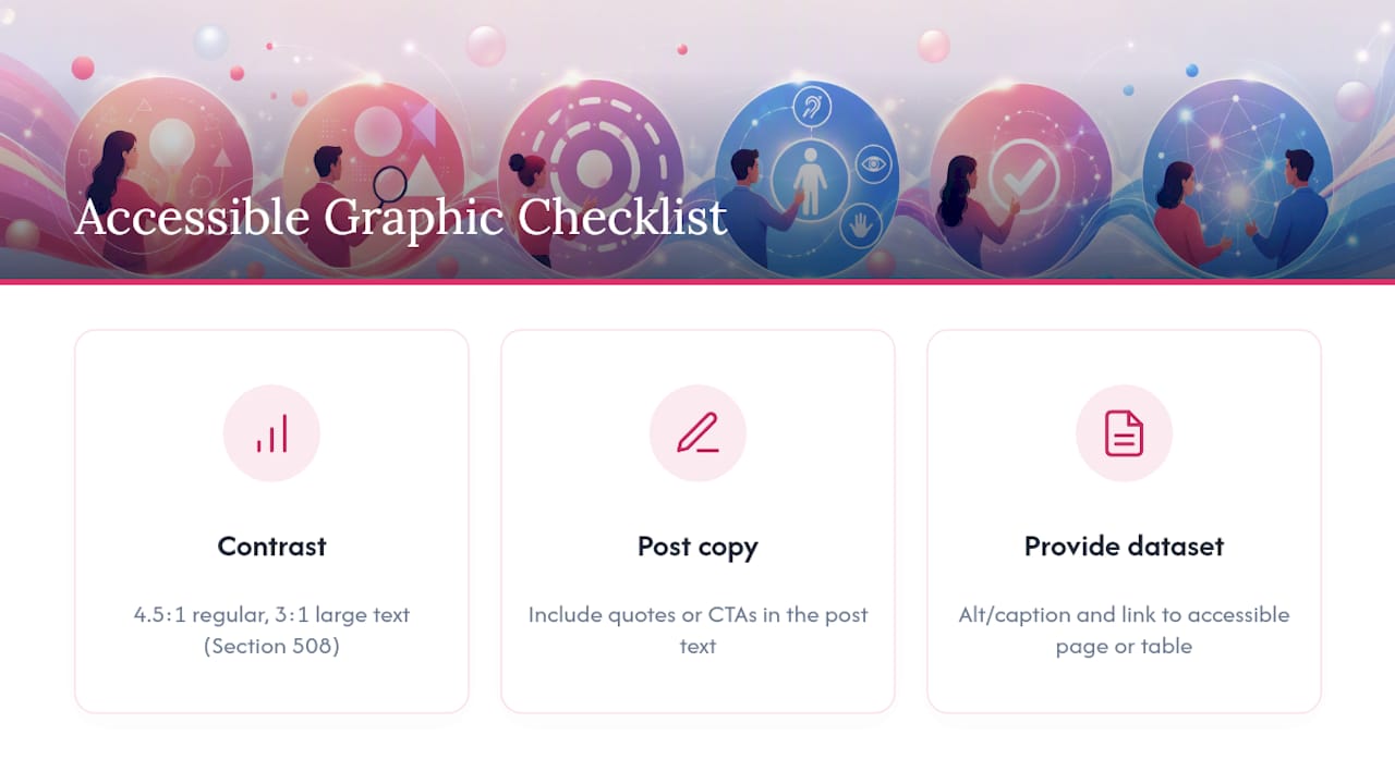
Contrast matters just as much as wording. Section 508 guidance sets a minimum ratio of 4.5:1 for regular text and 3:1 for large text, and free contrast checkers can confirm a graphic passes before you post it. Whenever a graphic carries a quote or a call to action a reader must act on, put that text in the post copy too. Embedding it only inside the image guarantees screen reader users miss it entirely.
Captioning and Describing Your Video Content
Auto-captions get video content most of the way there, but they need a human editing pass before publishing. They frequently misspell names, brand terms, and industry jargon, which is exactly the content viewers most need to get right, per Accessible.
Open captions, burned directly into the video frame, are the safer bet on platforms that strip closed captions when content gets reshared or downloaded. Closed captions stay the better default everywhere else since viewers can toggle them off.
Audio description matters when a video conveys meaning through visuals alone, a product demo or a silent visual gag, for instance. When full audio description isn’t practical, a short text overlay or caption line describing the key visual action covers most of the gap.
- Live video is the hardest case: real-time captioning tools exist on some platforms, but coverage is inconsistent.
- If live captioning isn’t available, publish the captioned recording afterward so the content is still accessible on replay.
One figure worth sitting with: muted autoplay is now the default viewing experience across most feeds, which means captions aren’t a disability accommodation alone anymore. They’re the only way most viewers absorb your video’s message at all.
Writing Copy That Screen Readers and All Minds Can Follow
Short sentences and a clear lead help every reader, but they’re essential for screen reader users and people with cognitive disabilities who process linear audio output rather than skimming visually. Spell out an acronym the first time you use it, then abbreviate freely afterward.
Format multi-word hashtags in CamelCase, like #SmallBusinessTips instead of #smallbusinesstips, so screen readers announce each word instead of reading one long string. Place hashtags and mentions at the end of your post so they don’t interrupt the sentence flow while it’s being read aloud, a practice Accessible.org recommends across platforms.
Emojis get announced by name, so a string of five emojis in a row reads as five spoken words back to back. Use them sparingly and only at natural sentence breaks. Write link text that names the destination, “read the full report,” rather than a bare URL or “click here,” since a bare link tells a screen reader user nothing about where it leads.
A Pre-Publish Checklist You Can Actually Follow
Accessibility holds up best as a routine, not a memory test. Run this sequence before any post goes live:
- Alt text added to every image, written for meaning rather than detail.
- Captions uploaded or edited, never left as unreviewed auto-captions.
- Contrast checked on any graphic carrying text.
- Hashtags formatted in CamelCase and moved to the end of the post.
- Link text describes the destination instead of reading as a raw URL.
- Emoji count kept low, placed at natural pauses.
Bake these six checks into your templates and your content calendar, so new posts are “born accessible” instead of retrofitted after a complaint. A simple two-person review, where one person drafts and a second person runs the checklist, catches most misses before publishing. On-device, a quick screen reader preview, a caption playback test, and a contrast checker app cover the rest in under two minutes.
Pro Tip: Keep the checklist inside your scheduling tool’s notes field for each post, not in a separate document nobody opens on deadline.
Standards and Tools Worth Bookmarking
W3C’s WAI guidance covers authoring-tool and social content standards directly. Section 508 governs captioning and audio description for federal and government-adjacent communicators. Pair those with a contrast checker and WebAIM’s alt text rules, then check each platform’s own help pages for upload specifics before you post.
Why Accessibility Fails as a One-Time Fix
Most accessibility advice treats it as a final review step, something you check right before hitting publish. That’s backwards, and it’s why so many brands slide back into inaccessible habits within a few weeks of a well-intentioned push. The Born Accessible approach makes a better case: build the prompts into the tools people already use to create content, so skipping alt text or captions takes extra effort instead of being the default.

The conventional checklist culture also overrates individual willpower and underrates workflow design. A marketer juggling five platforms on a Friday afternoon will forget an accessibility step under a template that doesn’t ask for it, no matter how well they know the rules. Fix the template, and the step stops being optional.
If you take one thing from this, prioritize the workflow over the reminder. Reusable templates with alt text fields, caption prompts baked into video exports, and a content calendar that flags accessibility checks alongside publish dates will outperform any static checklist pinned to a wall. The rules themselves are simple. The failure point is almost always process, not knowledge.
— Jon
Turn Your Accessibility Checklist Into a Repeatable Template
This platform is built for teams that don’t want accessibility to depend on someone remembering a checklist under deadline pressure. Template fields prompt for alt text and caption review during the design step itself, not as a separate task bolted on afterward, and the shared asset library keeps approved imagery and brand colors within contrast standards from the start.
That matters most for teams managing recurring campaigns across multiple accounts, where one missed alt text field on Monday becomes a pattern by Friday. Brand governance controls keep every contributor working from the same approved visuals and color palette, so contrast issues get caught before a graphic ever reaches a composer window. Pair the templates with Photofy’s free content calendars to schedule accessibility checks alongside your regular publish dates, and the practice becomes part of the workflow instead of an extra step. Explore Photofy’s platform to see how templates and scheduling fit your team’s current content routine, or check out Photofy’s personal solutions if you’re managing your own accounts solo.
Where to Verify These Standards Yourself
- W3C WAI: social media accessibility guidance
- Section 508: synchronized media requirements
- WebAIM: alt text technique guide
- Accessible
- Web accessibility and SEO impact
Sources
- W3C WAI: ATAG – Social media
- Section508: synchronized media guidance
- WebAIM: Alternative Text
- Accessible
FAQ
What is the minimum contrast ratio for text on social graphics?
Body text needs at least 4.5:1 contrast against its background, and large text needs at least 3:1, per Section 508 guidance.
Should I trust auto-generated captions as final?
No. Auto-captions frequently misread names and technical terms, so always review and correct them before publishing, according to Accessible.org.
How long should alt text be?
Keep alt text short, roughly under 150 characters, and focused on what the image communicates rather than every visual detail, following WebAIM’s guidance.
Where do hashtags belong in an accessible post?
Place hashtags at the end of the post in CamelCase formatting, like #ContentCalendar, so screen readers announce each word clearly.
Can templates help teams stay consistent on accessibility?
Yes. Building alt text and caption prompts directly into templates, the approach Photofy takes with its content creation tools, reduces the chance a step gets skipped during a busy posting schedule.