

Marketers: 10 Pasteable Social Media CTAs, Platform Ready Templates
A social media call to action is a short prompt that tells a viewer their next step, built from a verb, a benefit, and sometimes urgency. The best formula is verb + benefit + optional urgency, kept under eight words. A working example: “Save this list before it disappears.”
TL;DR:
- The placement of a CTA significantly influences its effectiveness, with positions like the first caption line or in-video overlays proving more impactful.
- Writing concise, benefit-focused CTAs under eight words that include an action, a clear advantage, and a sense of urgency increases conversion rates.
- Testing CTA copy, color, and placement separately with larger sample sizes provides the most reliable insights into what resonates with your audience.
- Different social platforms demand tailored CTA phrasing: Instagram favors first-line and bio links, TikTok responds to in-app interactions, and LinkedIn prefers professional outcomes.
- Using microcopy like “no credit card required” or “takes 2 minutes” diminishes hesitation and clarifies the effort involved before action.
Table of Contents
- What Is a Social Media Call to Action, and Why Does Placement Matter?
- The CTA Formula That Converts, and Three Rules to Tighten Any Draft
- Platform-Specific CTAs: What Works on Each Feed
- A Goal-Based Swipe File: CTAs Sorted by What You’re Actually Trying to Achieve
- Design and Microcopy Rules That Make a CTA Actually Visible
- How to Test a CTA and Know If It Actually Worked
- Ten Plug-and-Play CTA Templates You Can Paste Today
- Photofy Resources That Help You Ship CTAs Faster
- Three Rules I Use for Every CTA I Write
- Build, Schedule, and Measure CTAs Without Starting From Scratch
- Where This Guide’s CTA Guidance Comes From
- Sources
What Is a Social Media Call to Action, and Why Does Placement Matter?
A social media CTA is different from a caption or a CTA button, even though marketers often mix the terms up. The caption is the surrounding story. The CTA is the specific instruction inside or after it. A CTA button is the platform’s built in mechanism (Shop Now, Learn More, Sign Up), while a written CTA is the phrase you compose yourself in a caption, overlay, or comment.
The gap between a post with a CTA and one without is not small. Switching from text-based prompts to button-style CTAs lifted click-through rates by 32.12% in one documented case study, and that pattern holds across most formats: a viewer who is told exactly what to do is far more likely to do it than one left to guess.
Where you place that instruction changes how well it performs. A CTA works differently depending on where it sits in the user’s scroll:
- Caption opener: the first line, before the “more” cutoff, where skimmers actually read
- Story sticker: a poll, question box, or link sticker layered on a Story frame
- In-video overlay: text burned into the video itself, timed to a key moment
- Bio link: the single clickable URL a profile allows, paired with caption instructions to “tap the link in bio”
- Paid ads: the button plus adjacent ad copy working together
Each placement asks the viewer for a different kind of effort, and that effort level should shape which CTA you choose.
The CTA Formula That Converts, and Three Rules to Tighten Any Draft
Every high-performing CTA follows the same skeleton: verb + benefit + optional urgency. The verb tells the viewer what to physically do. The benefit tells them why it’s worth doing. Urgency, when it’s honest, gives them a reason to do it now instead of later.
Look at the difference in practice:
- Verb + benefit: “Download the free template” tells the viewer exactly what they get, not just what to click.
- Verb + benefit + urgency: “Grab the template, free through Friday” adds a real time boundary.
- Weak version: “Click here” gives a verb with no payoff attached, which is why outcome-led phrasing consistently outperforms procedural phrasing in side-by-side tests.
Microcopy is the small print sitting next to the main CTA, and it does more work than most marketers give it credit for. A line like “takes 2 minutes” or “no card required” removes a specific hesitation before it forms. Place microcopy directly under or beside the CTA, never above it, so it reads as reassurance rather than a separate thought.
Three edits tighten almost any CTA you write:
- Cut vague verbs. “Check this out” tells the viewer nothing. “Watch the 30-second demo” tells them exactly what they’re trading their time for.
- Cap it at 6 to 8 words. Anything longer starts reading as an instruction manual, and mobile users skim past paragraphs.
- Lead with the verb. “Comment below with your pick” outperforms “If you have a pick, comment below” because the action arrives before the reader’s attention drifts.
Pro Tip: Write your CTA last, after the rest of the caption, then read only the first and last lines out loud. If the CTA doesn’t stand on its own without the paragraph above it, it’s still too dependent on context the scroller won’t wait for.
This formula, backed by conversion research across A/B tested CTA datasets, holds up whether you’re writing for a five-second Story or a three-minute video.
Platform-Specific CTAs: What Works on Each Feed
The same CTA formula needs different phrasing depending on where it lands, because each platform trains its audience to respond to a different kind of prompt. Short-form platforms reward low-friction actions, while link-oriented platforms need explicit link copy and clear placement.
Instagram rewards CTAs placed in the first line of a caption, before the fold. Try “Save this for your next shoot” or “Tag someone who needs this.” Story stickers work best when the CTA matches the sticker type exactly, a poll sticker paired with “Vote: coral or navy?” rather than a generic prompt. For bio links, be specific: “Tap the link in bio for the full guide” beats a bare “link in bio.”
TikTok audiences respond to low-friction, in-app actions over anything that sends them away from the video. “Comment your guess” or “Duet this if you disagree” keep the interaction inside the platform, which the algorithm tends to reward. Overlay text should repeat the spoken CTA at the exact second it’s said, since many viewers watch muted.
LinkedIn CTAs skew toward professional outcomes: downloads, comments, and event sign-ups. “Comment with your take” invites discussion that boosts reach, while “Download the 2026 benchmark report” or “RSVP for Thursday’s webinar” work because LinkedIn audiences expect a clear professional payoff before they click.
Facebook and X split into two lanes. Organic posts lean on caption CTAs (“Share this with your team”), since native buttons carry less weight without ad spend behind them. Paid posts should lean on the button itself (Shop Now, Learn More) paired with caption copy that reinforces rather than repeats it.
YouTube benefits from CTAs timed to moments, not just placed at the end. An in-video overlay at the video’s most valuable point (“Full checklist linked below”) captures viewers before they drop off. End-screen CTAs should pair the subscribe ask with a benefit: “Subscribe for weekly teardown videos” outperforms a bare “Subscribe” by giving the viewer a reason tied to future value.
Pinterest users are already in a save-and-plan mindset, so CTAs should match that intent. “Save for your next renovation” or “Click through for the full tutorial” work because they extend the browsing behavior the platform already encourages, rather than asking users to switch modes.
A Goal-Based Swipe File: CTAs Sorted by What You’re Actually Trying to Achieve
Every CTA should map to one specific goal. Trying to ask for a comment, a click, and an email address in the same sentence usually gets you none of the three.
- Engagement CTAs. “Which one would you pick, A or B?” and “Tag a friend who’d love this” work because they ask for a single, low-effort response. Use these when your goal is reach and algorithmic signal, not conversion.
- Traffic CTAs. “Tap the link in bio for the full breakdown” and “Full article linked below” push viewers off-platform. Add a UTM parameter to every link you post this way, or you’ll have engagement data but no idea which post actually drove the visit.
- Lead CTAs. “Download the free checklist” and “Claim your spot before Friday” work because they name the exact asset. Pair these with microcopy like “no email spam, just the download” to address the hesitation before it forms.
- Sales CTAs. “Shop the sale, 24 hours only” and “Get 20% off, code ends tonight” combine benefit and urgency directly. Place these late in a caption or as overlay text on the product shot itself, where intent is already highest.
- Community CTAs. “Join the group for early access” and “Share this if you’ve been there too” build the kind of network effect that outlasts a single post. These perform best when the ask feels like an invitation rather than a request.
Templates like these exist across most CTA roundups because organizing prompts by campaign goal helps teams deploy and test variants faster than starting from a blank caption box every time.
Design and Microcopy Rules That Make a CTA Actually Visible
A well-written CTA that nobody can read or tap is wasted copy. Contrast matters more than most marketers assume: text overlaid on a busy background disappears at thumbnail size, even if it reads fine on a full screen. Leave whitespace around your CTA text so it isn’t competing with a logo, a face, or a product shot for attention.

Tap targets matter just as much as visibility. Usability guidance sets a minimum tappable size of 44 by 44 pixels, and a button smaller than that on a mobile screen creates real friction, missed taps, frustrated re-taps, and eventually, an abandoned action.
For longer-form content like YouTube videos or carousel posts, repeat the CTA at each natural decision point rather than saving it for the end. A viewer who drops off at the 90-second mark never sees a CTA placed at 3:00.
Microcopy does quiet, disproportionate work here:
- “No credit card required” removes the cost objection before it’s even asked.
- “Takes 2 minutes” sets a time expectation that feels achievable.
- “We never share your email” answers a privacy concern the viewer may not voice but definitely has.
Practitioner testing on microcopy phrasing consistently shows that a two to four word reassurance next to a CTA can shift how a viewer perceives the ask, often before they’ve fully read the offer itself.
How to Test a CTA and Know If It Actually Worked
Guessing which CTA performs better wastes both time and reach. Testing tells you.
- Pick the metric before you test. Engagement CTAs get measured by engagement rate, traffic CTAs by click-through rate and link clicks, and sales or lead CTAs by conversion rate. Testing the wrong metric makes a winning CTA look like it failed.
- Change one variable at a time. Test copy against copy first. Once a winning line emerges, test color or placement next. Combining changes means you can’t tell which one moved the number.
- Split traffic evenly and run long enough to matter. A test that ends after six hours or 200 impressions isn’t a result, it’s noise. Give each variant enough volume to reach a stable pattern before calling a winner.
- Start with copy, not design. Copy tests are cheap and fast to build. Save color and placement experiments for once you already know which message wins.
- Read lift against sample size, not just percentage. Aggregate A/B testing benchmarks show average uplifts of 23.2% across large sample sizes, but a 23% lift on 40 impressions means almost nothing. The same lift on 4,000 impressions is a real signal worth acting on.
Run these tests on a schedule instead of one-off bursts, and the pattern across your own audience will start to matter more than any published benchmark.
Ten Plug-and-Play CTA Templates You Can Paste Today
Each of these follows the verb + benefit + urgency skeleton, ready to drop into a caption, overlay, or ad with minor edits for your product or offer.
- “Save this before it disappears from your feed.”
- “Grab the free guide, no email required.”
- “Comment ‘me’ if this is you too.”
- “Shop the drop, first 50 only.”
- “Download the checklist, takes under 2 minutes.”
- “Tag a friend who needs to see this.”
- “Claim your spot, closes Friday at midnight.”
- “Follow for the next one in this series.”
- “Share this if it made you laugh.”
- “RSVP now, seats are limited.”
Small tone shifts change the same CTA’s fit dramatically. “Download the checklist” reads professional and fits LinkedIn or an email capture ad. Swap it to “Grab the cheat sheet, it’s free” and the exact same offer suddenly reads playful enough for Instagram or TikTok. Match the tone to the platform, not just the goal.
Photofy Resources That Help You Ship CTAs Faster
Writing a strong CTA is only half the job. Getting it into a post, in the right format, on time, is the part that actually determines whether it gets tested at all. Photofy’s free content calendars give teams a starting structure for planning CTA-driven campaigns across a month instead of scrambling post by post.
For agency and franchise teams, white-label templates keep CTA phrasing and visual branding consistent across every account a team manages, without each location rewriting copy from scratch. And once tests are running, reporting templates built for repeatable measurement mean a marketing team can track lift across weeks, not just guess at it from a single post’s numbers.
Three Rules I Use for Every CTA I Write
After years of watching CTAs win or die in the same feed, three rules hold up regardless of platform. First, lead with the benefit, not the action. The viewer doesn’t care that they can click. They care what clicking gets them. Second, remove friction before you add urgency. A confusing CTA with a countdown timer just confuses people faster. Third, test everything, because the CTA that performs best on your audience rarely matches the one that performs best in someone else’s case study.
The trade-off marketers get wrong most often is chasing cleverness over clarity. A clever CTA that requires a second read loses to a blunt one that’s instantly understood. When in doubt, cut the wit and keep the verb. For busy teams, the fastest next step isn’t a full rewrite of every caption. It’s picking your worst-performing post from last month and rewriting only its CTA using the formula above.
— Jon
Build, Schedule, and Measure CTAs Without Starting From Scratch
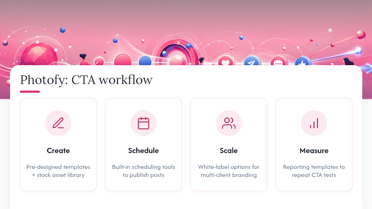
Writing a sharp CTA is one skill. Producing it consistently across a dozen posts a week, in the right dimensions, on brand, is a different job entirely, and it’s the one that quietly burns most social teams’ time. Photofy supplies pre-designed templates, a stock asset library, and scheduling tools built specifically so CTA-driven creative goes from draft to published without a designer on standby for every post.
Teams managing brand consistency across multiple locations, franchises, or client accounts get the most out of Photofy’s white-label options, which let an agency deploy the same CTA templates under each client’s own branding without rebuilding assets from zero. Real estate teams and direct selling brands running repeatable campaigns can lean on ready-made social templates built around exactly the kind of goal-based CTAs covered above.
If your team needs to prove which CTA actually moved the number, Photofy’s reporting templates turn that testing checklist into a repeatable report instead of a one-off spreadsheet. Start with the free content calendars to plan your next month of CTA tests, or explore Photofy’s platform directly to see the templates and scheduling tools in action.
Where This Guide’s CTA Guidance Comes From
The CTA formula, testing checklist, and platform notes above draw on HubSpot’s CTA example roundup for conversion benchmarks, Omniconvert’s CRO research for A/B testing structure, WordStream’s microcopy guidance for friction reduction, and Wix’s platform breakdown for channel-specific phrasing. Marketers wanting deeper conversion optimization tactics can also review this guide on crafting effective CTAs for additional testing frameworks.
Sources
- 49 Call-to-Action Examples You Can’t Help But Click — HubSpot
- 10 Call to Action Examples That Convert (2026) — Omniconvert
- 31 Call to Action Examples + Tips for Making a Great CTA — WordStream
- 30 powerful call-to-action examples that visitors can’t resist — Wix