
Creators: 15 Carousel Post Ideas With Three Part Micro Templates
Educational lists, before-and-afters, step-by-step tutorials, photo dumps, and product tours consistently outperform other carousel formats because each slide gives the swiper a reason to keep going. Carousel posts on Instagram see up to 72% higher average engagement than single-image posts, and the biggest lever you control is the first slide. Pick one format below, write a hook that names a specific payoff, and publish it this week.
TL;DR:
- Carousel formats like educational lists and before-and-after posts generate higher engagement by providing clear, actionable content that viewers are motivated to swipe through.
- Effective carousels follow a narrative structure with a compelling hook, a clear value proposition in the middle, and a strong proof and CTA at the end, focusing on one idea per slide.
- Visual consistency, high contrast, and a single CTA at the last slide improve swiper retention, while copying existing content like blog posts or reviews into carousels maximizes content use.
- The most successful post times depend on when your specific audience is active, with regular posting and analyzing drop-off data crucial for improving performance.
- Common mistakes such as overloading slides, weak hooks, and inconsistent design can be fixed easily and significantly boost swipe-through rates and engagement.
Table of Contents
- Carousel Post Ideas Sorted By What They’re Best For
- 15 Carousel Ideas You Can Copy and Publish This Week
- The Three-Act Structure Every Carousel Should Follow
- Design and Copy Rules That Keep Swipers Swiping
- Turning Content You Already Have Into a Carousel
- The Metrics That Tell You If a Carousel Worked
- What Photofy Brings to Carousel Creation
- What Is an Instagram Carousel, Exactly?
- When to Post Carousels for the Most Engagement
- The Mistakes That Quietly Kill Carousel Performance
- Adjusting Carousel Content for Your Specific Niche
- A Few Rules I’d Fight For
- Try Photofy for Your Next Carousel
- Sources
Carousel Post Ideas Sorted By What They’re Best For
Not every format fits every goal. Some carousel formats teach, some convert, and some just entertain long enough to earn a save. Match the format to what you actually want the post to do before you touch a template.
- Educational list — breaks a skill into numbered steps; great for coaches and consultants teaching a process. Example: “5 pricing mistakes new freelancers make.”
- Before and after — shows visible transformation across two or more slides; works for fitness, home renovation, and beauty brands. Example: “This closet went from chaos to color-coded in one weekend.”
- Step-by-step tutorial — walks through a process in sequential slides; strong for software, recipes, and DIY accounts.
- Photo dump with a twist — a curated, loosely themed set of images with a unifying caption; suited to lifestyle and travel creators who want a lower-effort, high-volume post.
- Product tour — features one product per slide or one angle per slide; retail and e-commerce brands use this to replace a full catalog scroll.
- Myth vs. fact — pairs a common misconception with the correction; works well for finance, health, and legal accounts building authority.
- Data snapshot — turns a single statistic or survey result into a visual breakdown across slides; B2B and research-driven brands lean on this format.
- Testimonial or UGC roundup — stitches together reviews, screenshots, or customer photos; ideal for service businesses building social proof.
Hootsuite’s own carousel guidance points to educational content, product reveals, and event recaps as the formats with the most consistent staying power. Choose the one that matches whether you’re trying to teach, convert, entertain, or inspire, then move to the templates below.
15 Carousel Ideas You Can Copy and Publish This Week
Each idea below comes with a three-part micro-template: a cover hook, a slide-by-slide breakdown, and a closing call to action. Swap in your own numbers and specifics, and most of these map cleanly to somewhere between three and ten slides.
- The quick-win tutorial. Hook: “Do this in 60 seconds before you post.” Slides: problem, tool needed, three action steps, result. CTA: “Save this for your next post.”
- The checklist. Hook: “5 things to check before you launch.” Slides: one checklist item per slide. CTA: “Which one did you miss? Comment below.”
- The myth-buster. Hook: “Everyone believes this about [topic]. They’re wrong.” Slides: myth, why it persists, the fact, the source. CTA: “Share this with someone who needs it.”
- The client transformation. Hook: “From [problem] to [result] in [timeframe].” Slides: starting point, the process, milestones, final result. CTA: “DM us to start yours.”
- The behind-the-scenes. Hook: “What actually happens before you see the finished product.” Slides: raw footage or process shots in sequence. CTA: “Follow for more real talk.”
- The testimonial stitch. Hook: “We didn’t write this. Our customers did.” Slides: one quote or screenshot per slide, escalating in specificity. CTA: “Read more reviews at the link in bio.”
- The product comparison. Hook: “Which one is right for you?” Slides: product A features, product B features, side-by-side, recommendation. CTA: “Shop the one that fits.”
- The event recap. Hook: “Here’s what you missed.” Slides: key moments in chronological order, standout quote or stat, next event teaser. CTA: “Get notified about the next one.”
- The data breakdown. Hook: “This number changed how we work.” Slides: the statistic, context, what it means for the reader. CTA: “Get the full report.”
- The list of resources. Hook: “10 tools we actually use every week.” Slides: two tools per slide with a one-line use case. CTA: “Save this list.”
- The Q&A roundup. Hook: “You asked. We’re answering.” Slides: one question and answer per slide. CTA: “Ask your question in the comments.”
- The seasonal guide. Hook: “Everything you need before [season/event].” Slides: prep steps in order. CTA: “Tag someone who needs this.”
- The founder story. Hook: “Why we started this.” Slides: the problem, the moment, the solution, where things stand now. CTA: “Follow along.”
- The industry trend explainer. Hook: “This is changing faster than most people realize.” Slides: the trend, the data, what to do about it. CTA: “Save this before it’s outdated.”
- The blooper or outtake reel. Hook: “Not everything makes it to the final cut.” Slides: quick, low-polish moments. CTA: “Follow for the ones that didn’t make it.”
The Three-Act Structure Every Carousel Should Follow
Strong carousels follow a narrative arc rather than a random stack of images, and the roles of each slide matter more than the total count — learn more in these visual storytelling tips to boost your brand’s impact.
- Slide 1: the hook. State a specific outcome or number, not a vague question. “3 mistakes costing you followers” beats “Want more followers?” every time.
- Slide 2: the setup. Frame why this matters or who it’s for, in one sentence.
- Middle slides: the value. One insight, tip, or step per slide. This is where Search Engine Journal’s carousel guidance matters most: cramming two ideas onto one slide kills retention.
- Second-to-last slide: the proof. A result, a stat, or a testimonial that makes the payoff believable.
- Final slide: the CTA. One ask, stated once.
Aim for several slides appropriate to your content length—enough to deliver value without losing reader interest.
Pro Tip: Treat the second-to-last slide as the real conversion moment, not the last one. Proof lands better right before the ask than buried at the very end where fewer people swipe.
Design and Copy Rules That Keep Swipers Swiping
Visual consistency does more for completion rate than clever copy. Keep these rules in place across every slide:
- One idea per slide, never two competing points.
- Use a font size large enough to read at thumbnail size on a phone screen.
- Keep contrast high between text and background; low-contrast text is the top reason people bounce off a slide.
- Repeat brand colors, fonts, or a small logo mark so the carousel is recognizable even out of context.
- Add a visual flow cue, like slide numbers or arrows, so people know more is coming.
- Tease information in the caption instead of repeating what’s on the slides, and give the carousel exactly one CTA, placed at the end.
Carousels built this way are part of why the format drives 72% higher engagement than single images. Before publishing, run a quick accessibility check: alt text on the cover slide, sufficient contrast, legible font size, and a compressed file so Instagram doesn’t degrade image quality on upload.
Turning Content You Already Have Into a Carousel
Most creators are sitting on raw material for carousels without realizing it. Three repurposing workflows cover most cases:
- Blog post to list carousel. Pull the H2 subheadings from a blog post and turn each into its own slide; the intro becomes your hook, the conclusion becomes your CTA.
- Webinar or live video to highlight carousel. Screenshot or pull quotes from the strongest three to five minutes and sequence them as key takeaways.
- Customer reviews to testimonial carousel. Collect screenshots or quotes, order them from good to best, and close with a CTA pointing to your product or service.
Slot each of these into your content calendar a week ahead of publishing, then handle scheduling and carousel design in Photofy, which keeps templates and past posts in one place instead of scattered across apps.
The Metrics That Tell You If a Carousel Worked
Impressions and reach tell you who saw it. Swipe-through rate, saves, shares, comments, and profile clicks tell you whether it actually worked. Saves and shares matter most, since both signal that someone found the content valuable enough to revisit or pass along.
Check where people drop off. If most swipers stop at slide 3, the value promised in your hook isn’t showing up fast enough.
- Hypothesize. Pick one variable, such as hook wording or slide count.
- Test. Run it across two to three posts, changing nothing else.
- Analyze. Compare swipe-through rate and saves against your baseline before rolling the change out everywhere.
What Photofy Brings to Carousel Creation
Photofy gives you pre-designed templates and a stock asset library so you’re not starting each carousel from a blank canvas, plus scheduling tools to queue posts against your content calendar. Enterprise and franchise teams get white-labeling and brand governance controls, which keep templates, colors, and messaging consistent across every location or team member posting. That combination speeds up production while keeping every slide on brand, whether one person is posting or fifty.
What Is an Instagram Carousel, Exactly?
An Instagram carousel is a single post that holds up to 10 photos or videos, which viewers swipe through horizontally instead of scrolling past a single image. Each slide in a carousel appears with an indicator showing the number of slides remaining below the image, showing how many more slides remain.
Unlike a Story, a carousel doesn’t disappear after 24 hours. It lives on the profile grid permanently, gets indexed in hashtag and search results the same way a single post does, and can mix photo and video slides in one post. That permanence is part of why carousels tend to accumulate saves and shares over a longer window than Stories ever can.
The format works because it rewards curiosity. A viewer who taps once to see slide 2 has already committed more attention than someone who simply likes and scrolls past a single image. Instagram’s own algorithm treats that continued interaction, extra time on post, more taps, as a signal the content is worth showing to more people. Hootsuite’s carousel guidance points to this exact mechanic as the reason carousels outperform static posts for reach, not just engagement.
For creators and brands, that makes the carousel less like a photo album and more like a mini-presentation. Each slide has a job, and the sequence is what turns a stack of images into a story.
When to Post Carousels for the Most Engagement
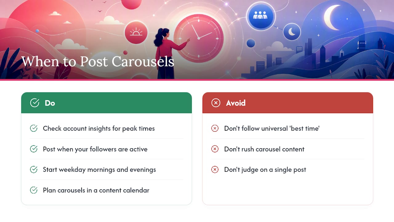
Carousels reward patience more than urgency, since people often swipe through slowly and revisit posts to reread a tip or restudy a before-and-after. Posting when your specific audience is actively scrolling still matters more than any universal “best time,” because engagement depends on when your followers are awake, off work, or on a break, not a single global schedule.
Check your own account’s insights for the days and hours your past posts have gotten the most engagement in the first hour, since that early window heavily influences how far Instagram distributes a post afterward. As a general starting point, many accounts see stronger performance posting on weekday mornings before work and again in the evening after dinner, though weekend patterns can flip depending on the audience.
Frequency matters as much as timing. Posting quality carousel content regularly tends to outperform frequent rushed posts. Carousels take longer to plan than a single image, so stretching your best ideas across a realistic weekly cadence protects quality. A content calendar that blocks out carousel topics in advance, rather than scrambling the morning of, keeps that consistency intact without burning you out. Track results for four to six weeks before drawing conclusions, since a single post’s performance can swing based on factors outside your control, like a platform-wide algorithm shift or a competing news cycle.
The Mistakes That Quietly Kill Carousel Performance
Most underperforming carousels fail for the same handful of reasons, and almost all of them are fixable before you hit publish.
Overloading a single slide with two or three ideas is the most common mistake. When a slide tries to teach a tip and make a joke and plug a product, it accomplishes none of the three, and swipers tend to move on without absorbing any of it.
A weak or vague hook slide is the second-biggest killer. “Some thoughts on marketing” gives a swiper zero reason to tap again, while “3 marketing mistakes that cost us $10,000” gives them a specific reason to stay.
Other frequent mistakes include:
- Burying the CTA across multiple slides instead of placing one clear ask at the end.
- Skipping the caption, which should tease the content rather than duplicate every word already on the slides.
- Inconsistent design between slides, mixing fonts, colors, or layouts so the carousel feels stitched together rather than built as one piece.
- Ignoring drop-off data, publishing the same structure repeatedly without checking where people actually stop swiping.
- Making the first slide look like an ad, which triggers the same instinct that makes people scroll past sponsored content.
Fixing even two or three of these on your next carousel usually moves swipe-through rate more than any single new “hack” would.
Adjusting Carousel Content for Your Specific Niche
A fitness account, a B2B software brand, and a local boutique need different carousel strategies even though the underlying three-act structure stays the same.
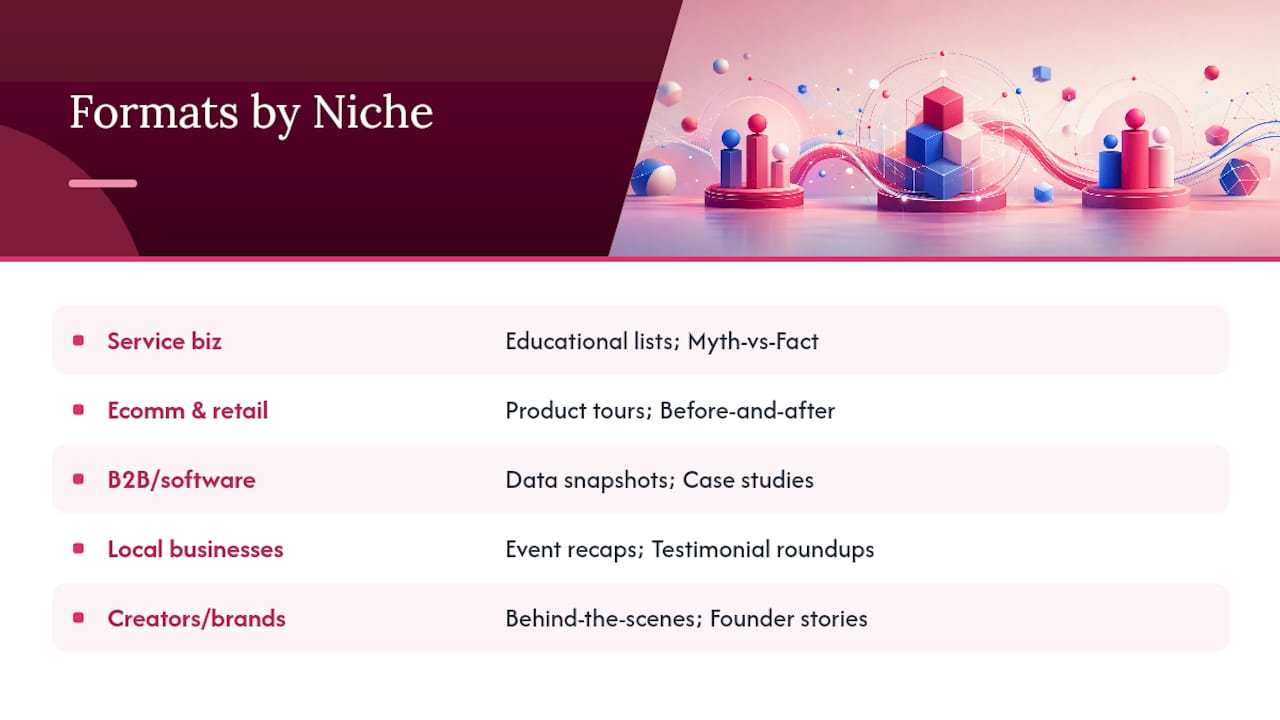
Service-based businesses (coaches, consultants, agencies) get the most mileage from educational lists and myth-vs-fact formats, since these build authority before someone ever books a call. A financial coach might run “3 signs you’re underpricing your services,” while a marketing consultant runs a myth-buster on ad spend.
E-commerce and retail brands should lean on product tours and before-and-after formats, since carousels let shoppers see multiple angles or use cases without leaving the app. A skincare brand showing a 30-day before-and-after in slide sequence does more work than five separate posts ever could.
B2B and software brands tend to perform best with data snapshots and case study carousels, since the audience is already looking for proof and specifics rather than inspiration. A single compelling statistic, broken into context across three slides, often outperforms a flashy design.
Local and community-based businesses (restaurants, gyms, real estate) get the most traction from event recaps and testimonial roundups, since these formats lean on recognizable faces and places that a hyper-local audience already knows.
Creators and personal brands benefit most from behind-the-scenes and founder-story formats, since audiences following a person, rather than a product, respond to authenticity over polish.
The format list stays the same across every niche. What changes is which two or three formats you lean on most heavily, based on what your specific audience is trying to decide when they land on your profile.
A Few Rules I’d Fight For
Write the hook before you design anything. If it doesn’t name a specific payoff, the slide design won’t save it. Give each slide exactly one idea, and put exactly one CTA on the last slide, not three scattered across the post.
Do check your drop-off data before your next carousel. Do write three hook options and pick the sharpest one. Don’t stack two ideas on one slide. Don’t skip the caption and assume the slides speak for themselves.
— Jon
Try Photofy for Your Next Carousel
Photofy gives you a faster starting point than building every slide from scratch in a generic design app. You get pre-designed templates built for carousel formats, a stock asset library so you’re not hunting for images mid-project, and scheduling tools that let you queue a week of carousels in one sitting instead of posting live each time.

If you’re managing content across a team or multiple locations, Photofy’s white-labeling and brand governance tools keep every carousel on-brand without you personally checking each one before it goes live. Start with the free personal tier to build your next carousel from a template, or visit Photofy’s main platform to see the scheduling and asset library in action.
Sources
- Average engagement rate on Instagram — Oberlo
- What is an Instagram Carousel? Tips and ideas | Hootsuite
- What should the last slide of an Instagram carousel be to maximise engagement? | JeffBullas
- Instagram carousels — Search Engine Journal